World Cup 2018
A cohesive identity was needed for the digital, print, audio and video coverage of the FIFA football tournament in Russia.
With 8 weeks to go before kick off, I had time to thoroughly research, sketch and plan how our coverage would look and function.
I looked at character illustration and the history of art and design in Russia. I referenced artists who worked mainly with geometric shapes and abstract patterns, such as Kandinsky and Lissitzky.
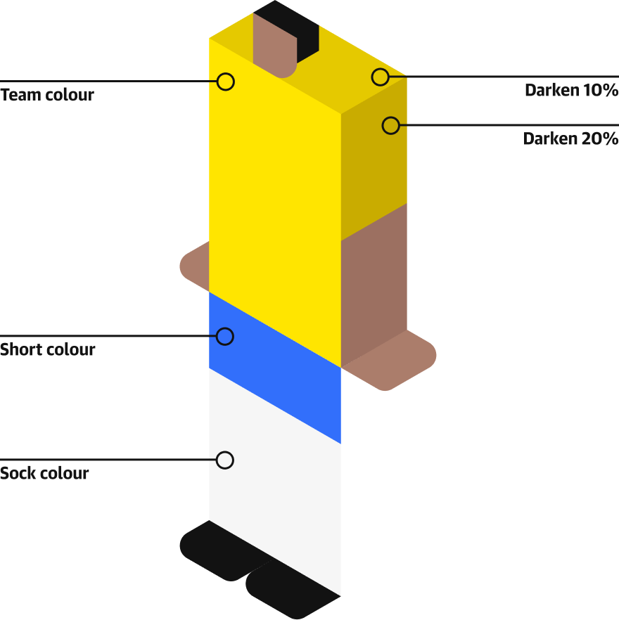
World Cups always have terrible mascots, so I thought it’d be nice to create a set of characters representing each team’s position. Working from an isometric grid gave me a structure that informed a style that was both geometric and unusual.
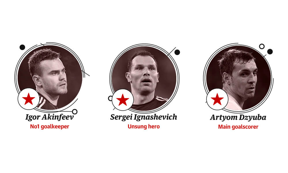
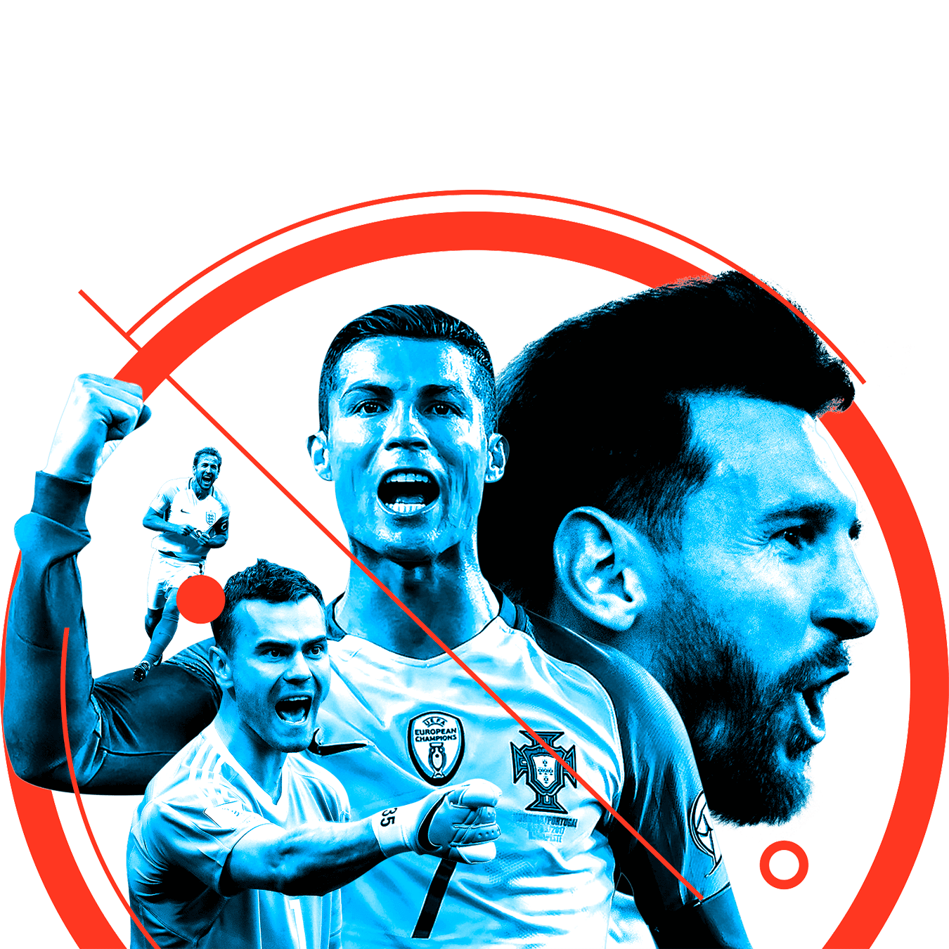
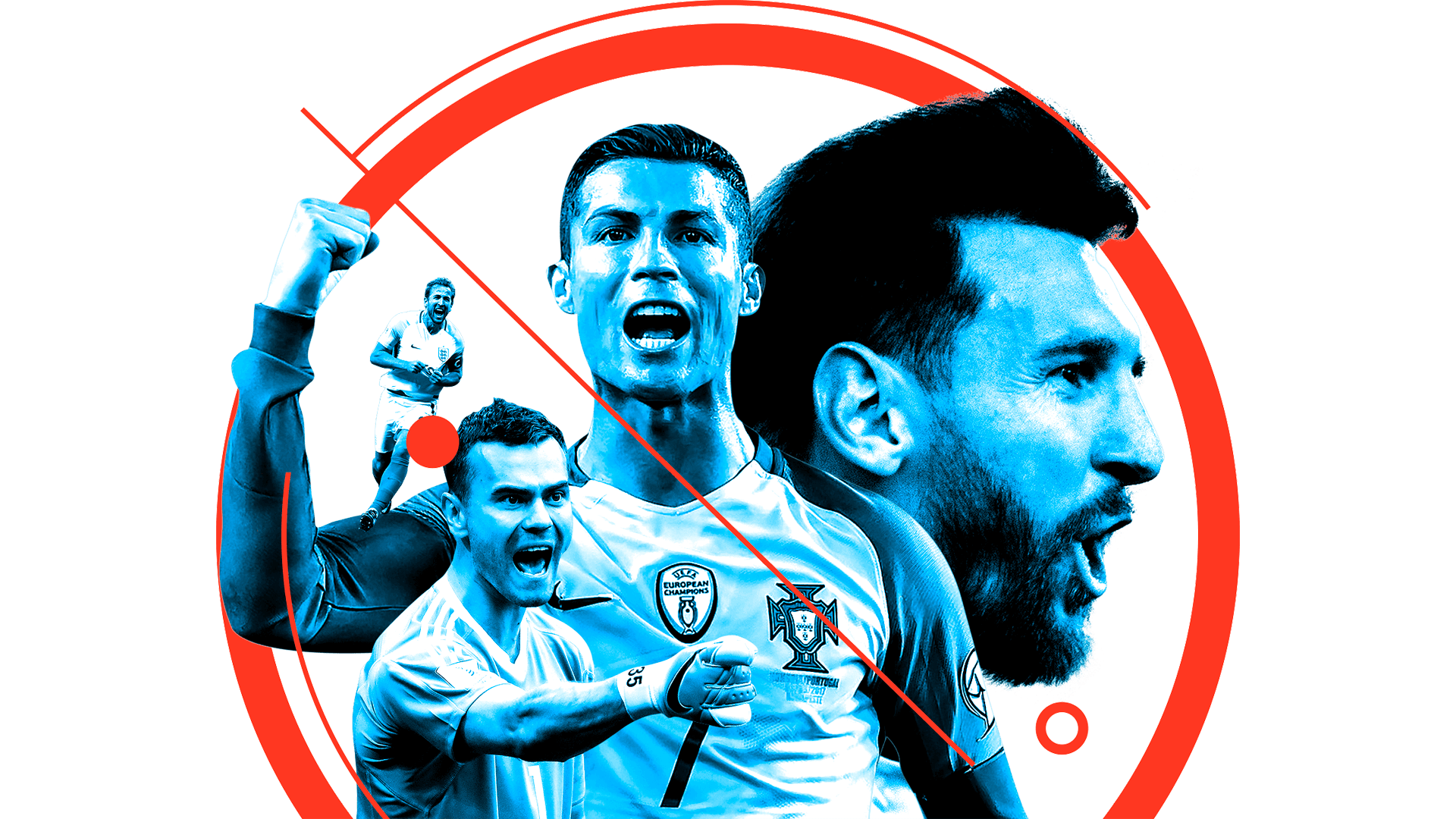
I set the photography style for goalscorers and fan favourites to reference the works of Kandinsky and Lissitzky.

I designed the logo and produced a company-wide style guide for multiple designers to use consistently throughout the newspaper, website and marketing materials.
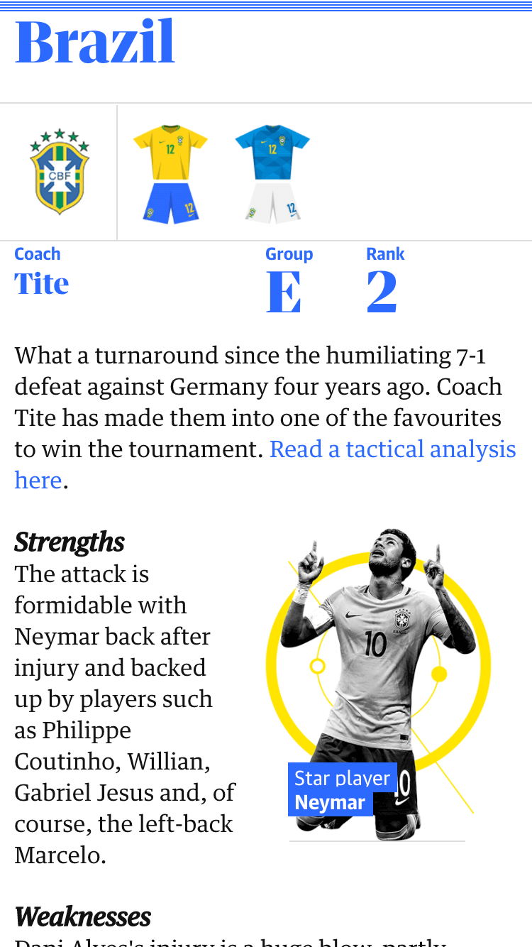
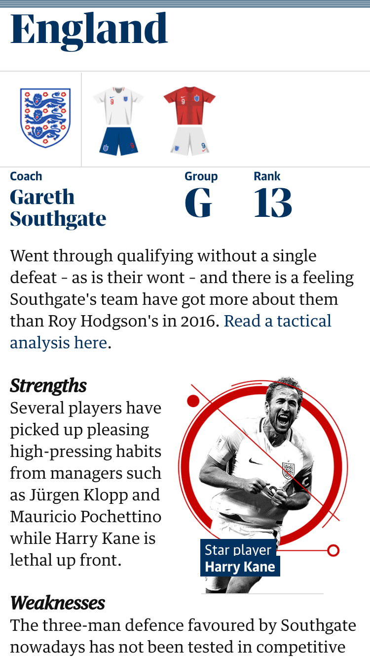
I produced a guide to every single player with the help of multiple journalists and a developer. It was a mammoth task to get people excited about the World Cup and to be useful as a constant resource throughout the tournament.
Outcome
The player guide was featured on reddit with 3.9k upvotes and went on to win an SND.
Page views over 24 hours