


The internet, but not as we know it
By the end of 2018, more than half of the world's population was online. As 3.9 billion people raised a glass to Tim Berners-Lee, I spent 8 weeks wading through Chinese microblogs and trying to piece together a coherent and appropriate homage to the internet – complete with some 90s nostalgia.
My brief was: "What does life look like online across the world?" More specifically, in India, Cuba, China and Russia?
The challenge was to create something that maintained a narrative structure while conveying each country's distinct character.
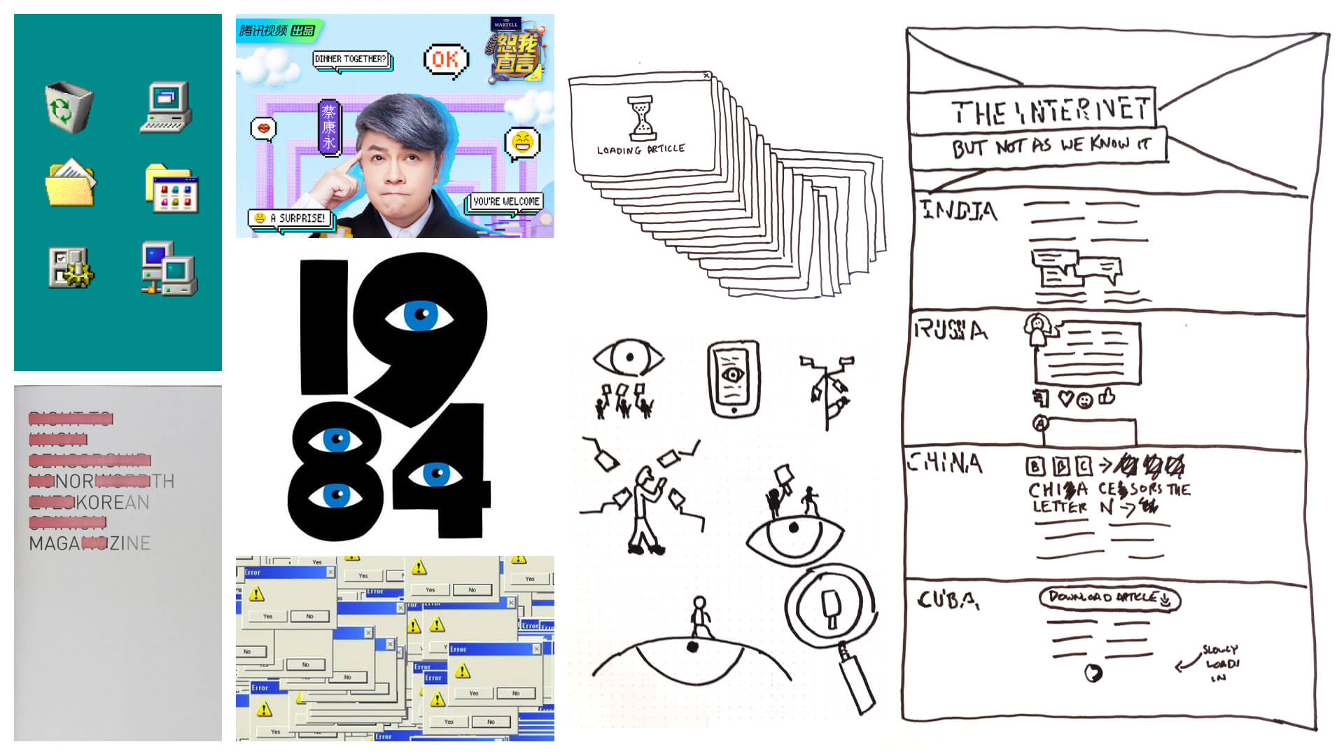
I looked at censorship, chat messaging, the early internet and Big Brother as references. I chose to focus on pixel design in order to tie together four very different countries.
India
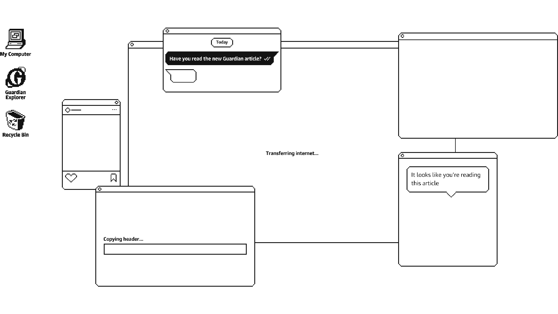
India is WhatsApp’s biggest market, with more than 200 million users. By starting with its familar format, readers instantly knew this wasn’t a regular news article and started scrolling.

Extra touch
The time of the messages was set to the reader's computer time
China
In China, Weibo dominates in place of blocked pages like Google and Twitter. I included elements throughout this section which referenced the site’s animated icons and the flickering of neon signs that are synonymous with East Asia.
Cuba
Over in Cuba, access to the internet is limited and expensive. Locals receive delivery of media through an external hard drive known as “The Weekly Packet”.
This was where the idea for pixelated design came from; screenshots of "The Weekly Packet" showed it running on an old version of Windows. The design was inspired by how Windows 3.11 looked and functioned.
Russia
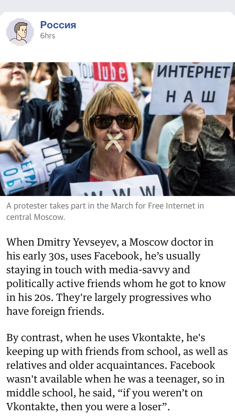
Meanwhile in Russia, the Government promotes local companies such as Vkontakte (a popular Facebook-like social network). Their relationship is controversial: a handful of users were charged with extremism after their online accounts had been searched by police. after police searched their online accounts for political content.
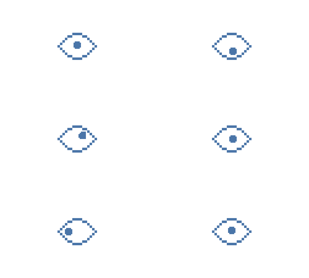
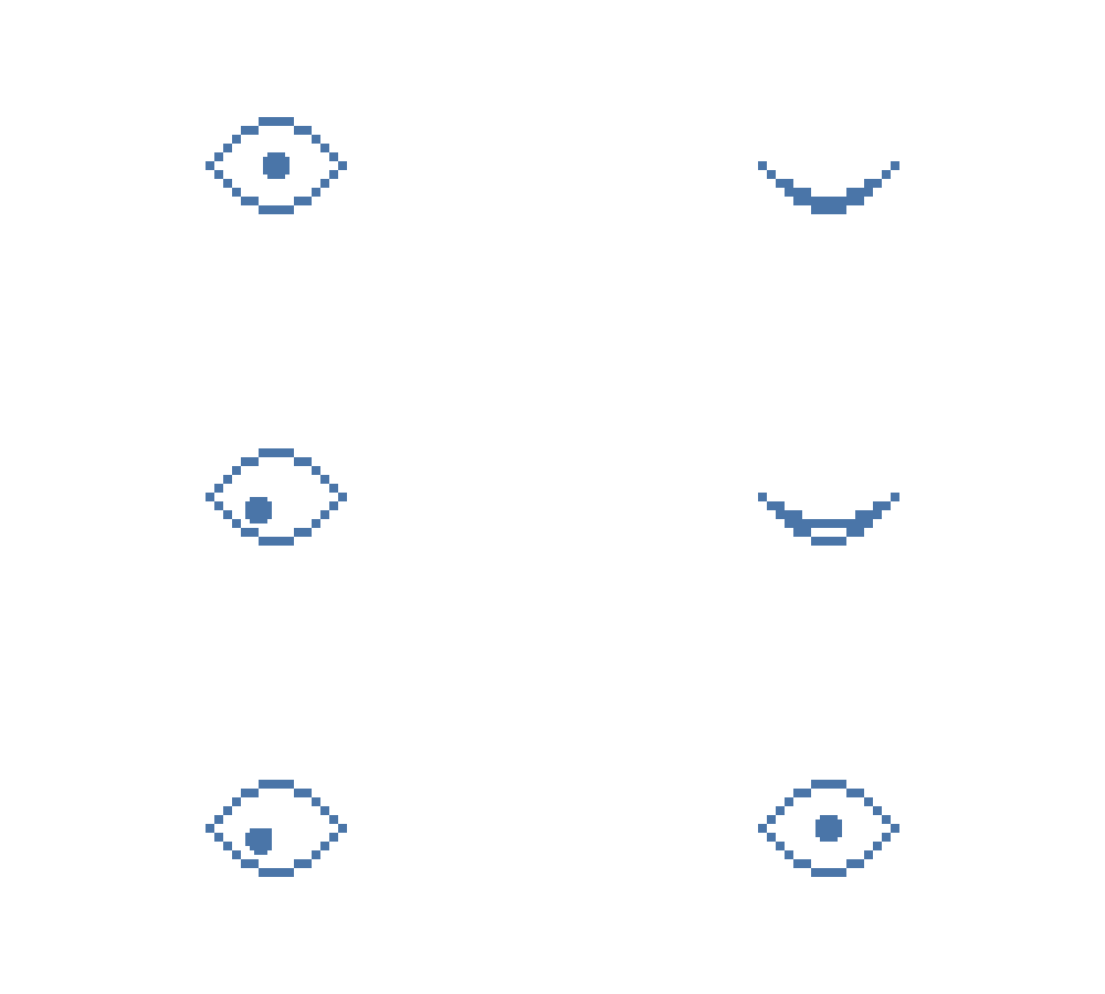
This section included additional features such as the reader being able to 'like' each post, add The Kremlin as a 'friend' and an animation of 1984-style eyes watching.
Outcome
The project was a great success and went on to win a D&AD Wooden Pencil, an SND, a Malofiej and was featured in Creative Review.
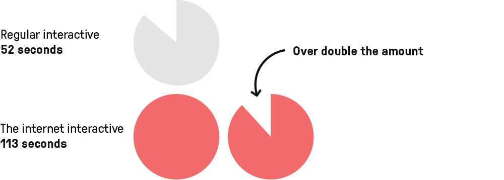
I was particularly proud of the article's viewing time – over double the length for an average interactive. As the piece was visual and unusual, people were easily drawn in and enjoyed reading to the very end.
Page views over 24 hours

Median attention time over 24 hours
