UK Election 2019
In journalism, election results draw more eyes than any other topic.
A long lead-up gave us the chance to get users into the UX lab to find out what worked – and what didn’t.
Looking at how previous elections had been reported by the Guardian and our competitors, I had some thoughts on how our coverage could be improved.
I asked our projects editors to sketch out initial ideas. It turns out none of us can draw the UK very well!
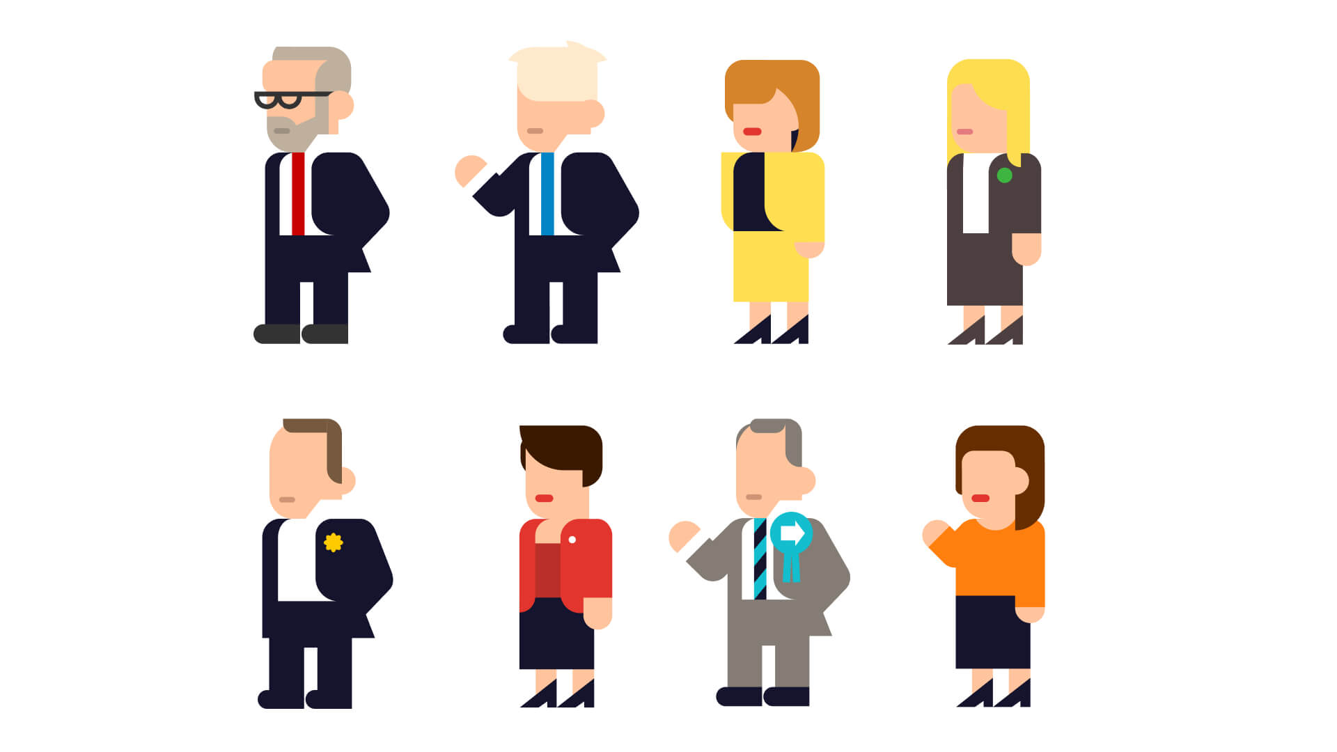
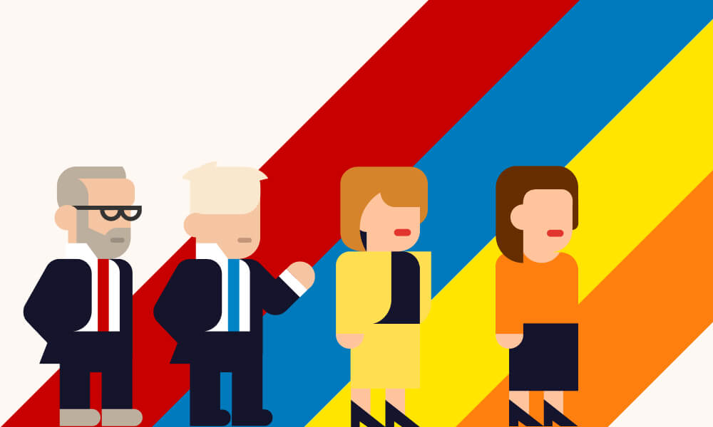
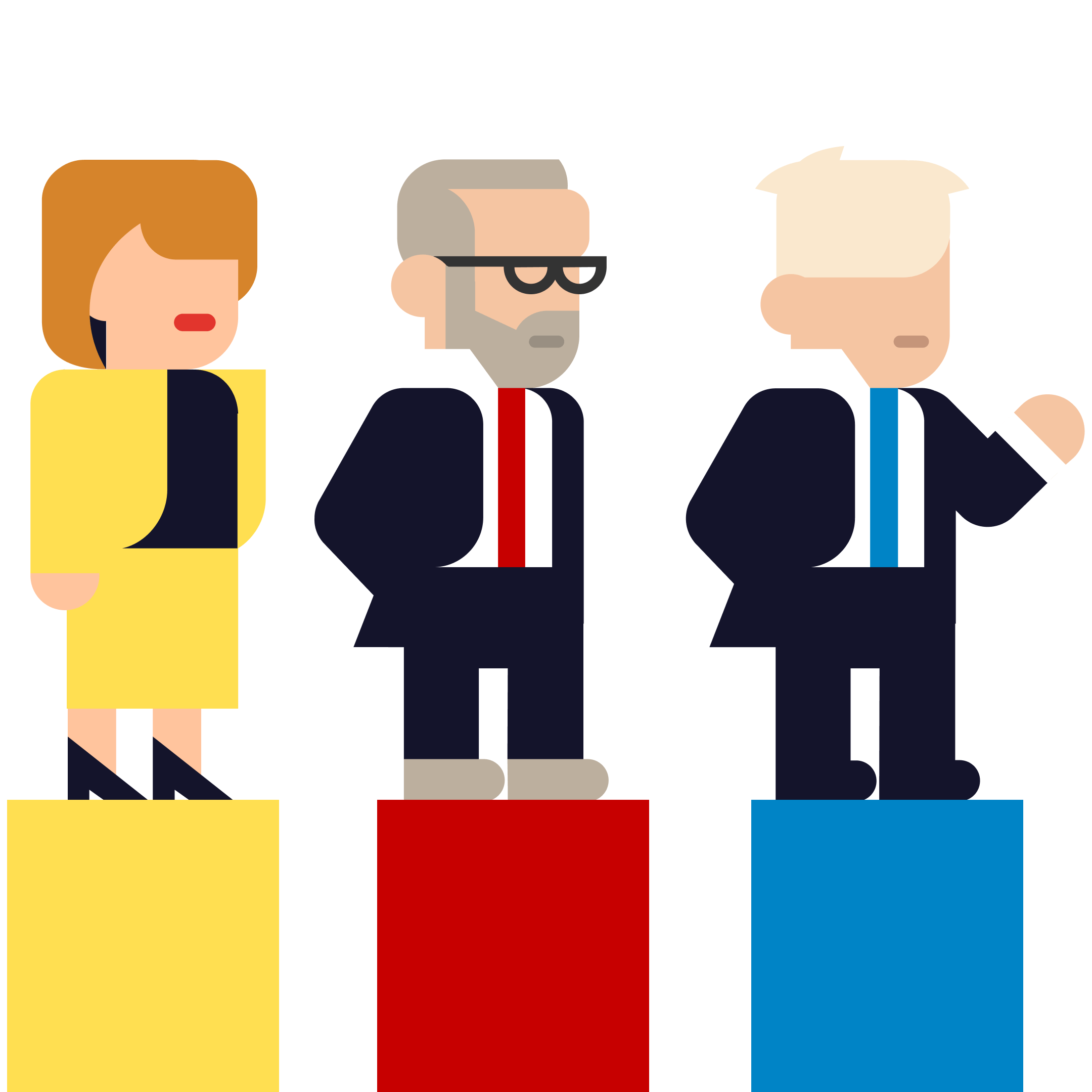
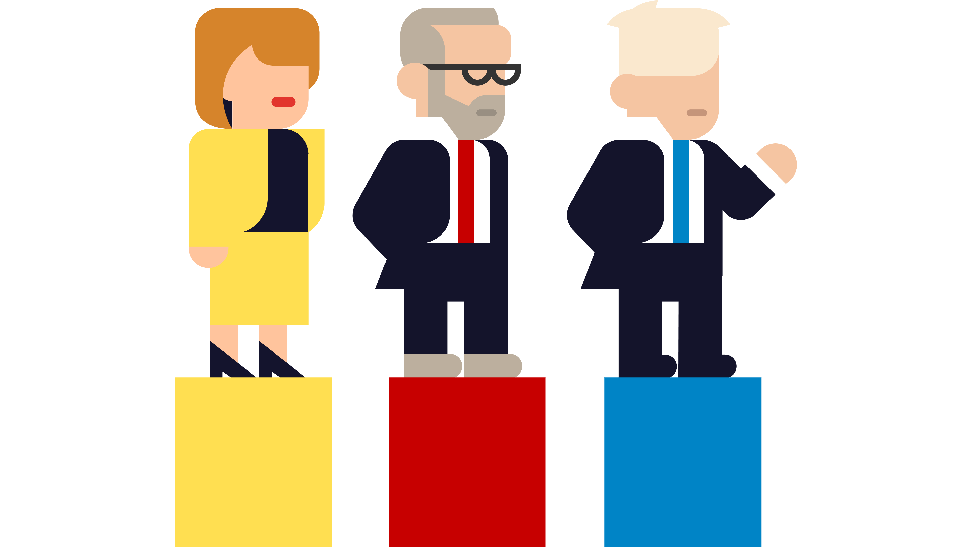
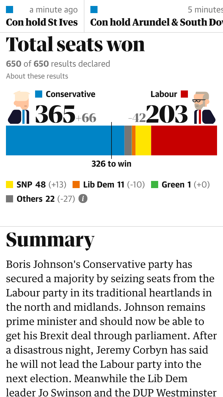
Working with an illustration style based on the previous election, I created characters representing each party’s leader — the hope being that it would bring some warmth to a winter election.
I created a prototype of a results page to run some testing with the UX team. I wanted to find out how to best present information that was easy to digest and made sense to all users.
Users found the Battlegrounds section confusing, so I worked with a graphics journalist to make it simpler. We chose to focus on key seats instead and designed slope charts to make it clear which party had won.
I updated the designs based on the recommendations that came from the testing. Because we were so prepared, a night that is usually incredibly stressful and hectic ran smoothly.
Outcome
Page views over 24 hours

It’s worth noting that this type of interactive always does huge numbers. The reason I’m highlighting them is to show why it was so important to test the designs.